Resume writing it getting pretty creative and fancy these days. People are designing them in photoshop, mixing fonts and colors, sending resumes on t-shirts (yes, really, I’ve gotten one) and much more. One thing people often ask me is about resume formatting – “how pretty or creative should my resume really be?”
This is one of those things that is really subjective. I suppose if you asked recruiters at different companies who were recruiting for different roles, you might hear different things. While I really do love the above resume design and think it’s incredibly well done, I don’t think your resume should be pretty or creative. This is why.
I think a resume is intended to showcase your experience without smoke and mirrors.
I realize I have to back up this statement… so here’s why I say this:
Recruiting systems are going to parse (aka: “chew up”) your fancy resume anyway
When you apply online for a role, you are generally asked to upload your resume into some sort of system. What this system does is “parse” your resume which essentially means it turns it into plain text and them absorbs and categorizes the information. One thing that is great about this for recruiters, is that it understands “key words” on your resume and it can actually make an assessment on how relevant your background (aka: key words) are based on the words in the job description. Pretty crazy.
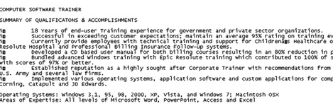
What this also means is that on the other end your resume doesn’t look like it did on the way in. Rather, it is now in plain text (see image below) and if it wasn’t originally formatted in a straightforward way, it may end up looking pretty sloppy in plain text. The more simple your resume was originally in a word doc, the more clear it will come out in plain text. So if you do have a fancy resume, be sure to review what the plain text looks like before hitting “done”. If you are seeing gibberish, that’s what the recruiter is seeing.
Sure, in some systems, the recruiter could choose to download the original version but with allocating only 15-30 seconds per resume screen, don’t count on it!
For most roles, it’s about what you’ve done, not how you present it
This is one of my core beliefs about recruiting and finding a job. No matter what you read out there about how to get ahead in the job search, getting called in for an interview based on a resume is about what you’ve done, not how you present it on a piece of paper.
In fact, I’ve hired many people with pretty terrible looking resumes because guess what? Resume writing skills were not core to the job we were hiring them to do! Compared to what you’ve actually done and the companies you’ve actually worked for, resume formatting does not matter.
Unless you’re an expert, it could end up looking unprofessional
This is a big one. Don’t get too out of your element! If you are not a photoshop professional, don’t try to go overboard with your resume formatting with colors, fonts, and creative layout. It is always better to submit something “plain” than unprofessional or sloppy. For example, I do think in the graphic design and creative world, it may be appropriate to have a really pretty, fancy, version of your resume like the one above. But you better be up to the task because that’s a reflection of your work!
Portfolios are a great supplement to show off your creative skills
The resume’s purpose is to show a recruiter quickly and efficiently what you’ve done. Of course, you may have some other skills and examples of your work you want to bring to the table. That’s exactly what a portfolio is for! Now it’s easier than ever to show off your work and there are many online resources to help you compile it. A portfolio (digital or otherwise) is a great way to show off those creative skills.
So those are my reason’s why I think (most of the time) you do not need to have a pretty or creative resume when it comes to resume formatting.
Of course, there’s something to be said for nice and pretty presentation. So if you really feel like you have the skills to make a pretty resume, go for it… but make 2 versions. One version (the pretty, creative one) can be for when you send your resume directly via email (in pdf). The other (more plain version) can be used for when you apply online. You want to make sure those robots can interpret your skills and not get caught up by fancy resume formatting!